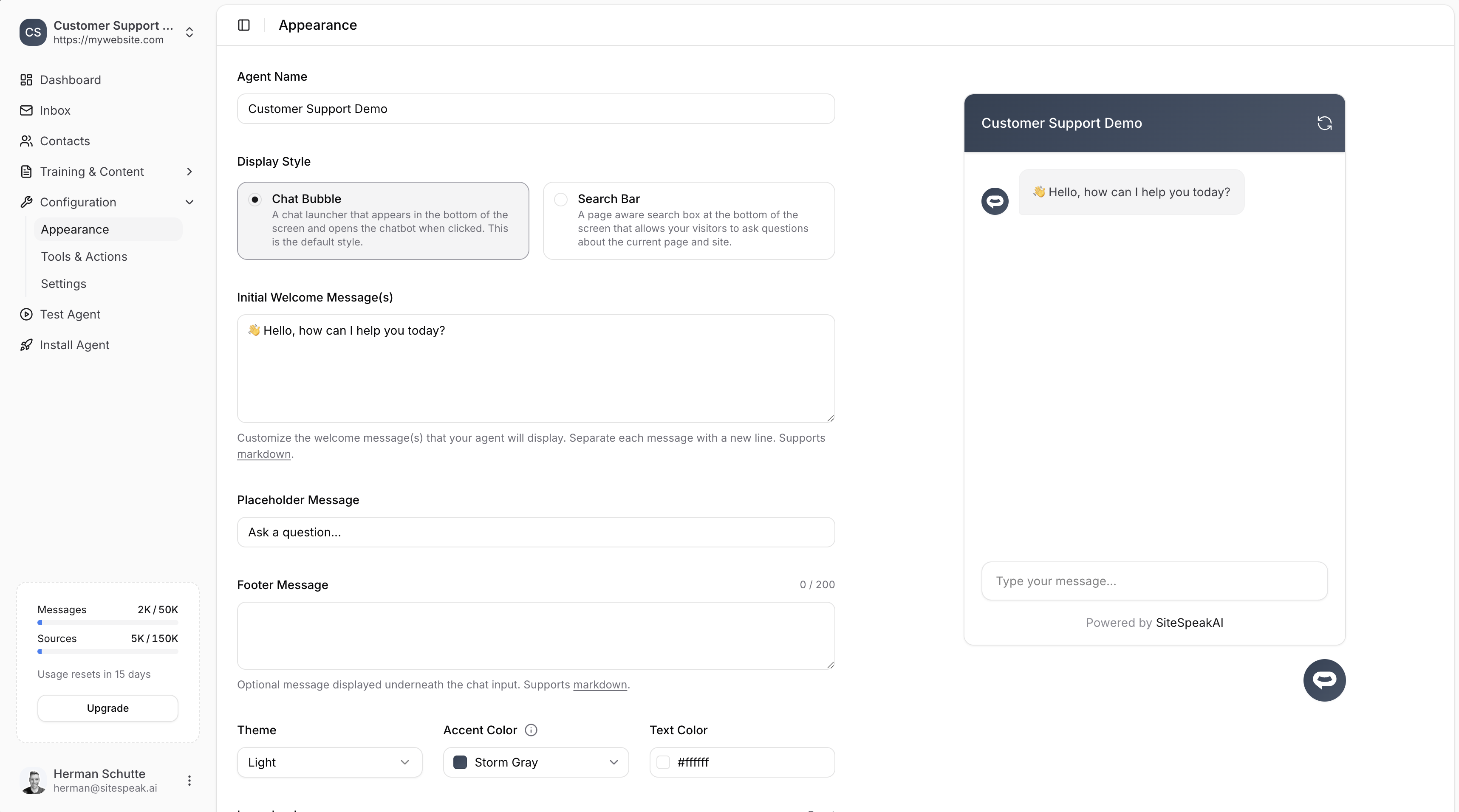
Display style
Choose how your chatbot appears on your website:Chat Bubble
A chat launcher that appears in the bottom of the screen and opens the chatbot when clicked. This is the default style.
Search Bar
A page-aware search box at the bottom of the screen that allows visitors to ask questions about the current page and site.
Branding
Agent name
The name displayed in the chat header. This is what your visitors will see when chatting with your bot.Welcome messages
Customize the initial message(s) your chatbot displays when opened. You can add multiple welcome messages by separating each with a new line.Placeholder message
The placeholder text shown in the chat input field (e.g., “Ask a question…”).Footer message
An optional message displayed underneath the chat input. Supports markdown. Maximum 200 characters.Theme & colors
Theme
Choose between Light or Dark theme for your chatbot.Accent color
The primary color used for buttons, links, and the chat header. Choose from preset colors or enter a custom hex value.Text color
The color of text displayed on accent-colored elements (e.g., the header). Typically white (#ffffff) for dark accent colors.
Icons
Customize the icons displayed in your chatbot:Click Reset next to any icon to restore the default.
Launcher text
Short text displayed in the launcher button (e.g., “Help”). Keep it short and sweet.Layout & behavior
Max height
Control the maximum height of the chat window. Default is 720px.Font size
Choose the font size for chat messages: Small, Medium, or Large.Header size
Choose the header size: Small, Medium, or Large.Position
Choose where the chat launcher appears on your website:- Bottom Right (default)
- Bottom Left
Advanced options
Auto popup welcome message
Set a delay before the welcome message automatically pops up. Options range from Off to several seconds (e.g., 3s).Auto scroll to new messages
When enabled, the chat window automatically scrolls to show new messages. Default is Yes.Display sources in messages
When enabled, shows the source links used to generate each response. Useful for transparency and allowing visitors to learn more.Sources label
Customize the label shown above source links (default: “Sources”).Horizontal scroll smart prompts
Enable horizontal scrolling for smart prompt suggestions.Hide “Powered by”
Hide the “Powered by SiteSpeakAI” branding in the chat footer.Removing the “Powered by” branding is available on paid plans.
Ready to automate your customer service with AI?
Join over 1000+ businesses, websites and startups automating their customer service and other tasks with a custom trained AI agent.